
Preppy style looks effortless until navy, khaki, green, pink, and stripes all compete in the same outfit. Building a practical preppy color palette men can actually wear starts with choosing dependable neutrals, then adding color with restraint.
This approach will help you coordinate shirts, chinos, knitwear, jackets, shoes, and accessories without turning your closet into a country-club costume department.
Start a Preppy Color Palette Men Can Build Around
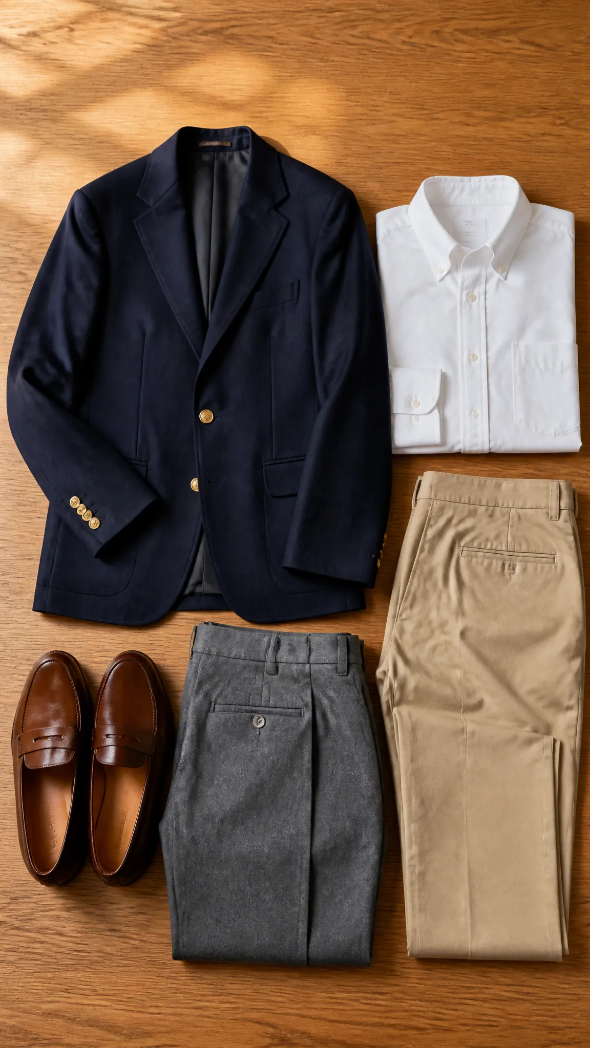
A useful palette needs structure before it needs personality. In classic American preppy style, that structure comes from versatile neutrals associated with garments such as navy blazers, khaki chinos, gray flannel trousers, white Oxford cloth button-downs, and brown leather loafers.
Begin with navy, white, khaki, and medium gray. Navy is softer and more adaptable than black, particularly beside warm leather and sun-washed colors. White brings clarity, khaki adds warmth, and gray creates a cooler bridge between tailored clothing and casual layers.
These colors do not need equal representation. Navy and khaki can carry substantial garments, while white may appear mainly in shirts, polos, and sneakers. Gray is especially useful in trousers, sweaters, sweatshirts, and outerwear because it settles brighter accents without making them look dull.
Black is not forbidden, but it rarely needs to lead the palette. Black dress shoes, severe black trousers, and a black belt can feel disconnected from softer preppy colors. Dark brown, burgundy, or oxblood leather usually creates a more natural transition.
Choose Accent Colors with a Shared Character
Once the neutral base is stable, accents give the wardrobe its identity. The key is not simply picking colors you like; it is choosing versions that relate to one another. Classic preppy accents often look slightly muted, sun-faded, earthy, or derived from traditional sporting and collegiate clothing.
Forest green, bottle green, burgundy, rust, mustard, sky blue, and pale pink all work comfortably with navy and khaki. Brighter shades such as coral, kelly green, Nantucket red, or sunny yellow can also fit, but they demand more restraint because they draw attention quickly.
A practical preppy color palette men can repeat across seasons might contain two subdued accents and one livelier option. For example, forest green and burgundy can handle sweaters, socks, and ties throughout cooler months, while coral supplies a warm-weather note in a polo or pair of shorts.
Undertone helps explain why some combinations feel coherent. Warm khaki pairs naturally with cream, rust, olive, coral, and brown. Cooler gray works smoothly with navy, burgundy, sky blue, and crisp white. These are useful relationships rather than rigid rules, so your complexion and personal taste still matter.
Control Color Through Garment Proportion
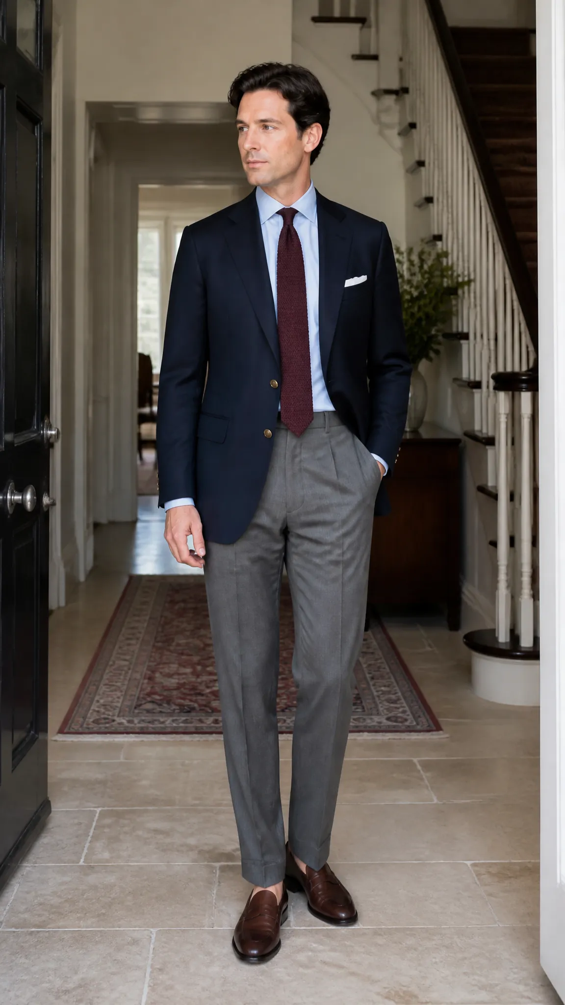
The amount of color matters as much as the shade. A bright color covering half the body makes a far louder statement than the same color appearing in a tie, cap, or striped belt. Preppy dressing tends to look most assured when one color leads, another supports it, and a smaller accent adds interest.
For an easy starting point, let neutrals occupy most of the outfit. Wear a navy sport coat and gray trousers with a pale blue shirt, then add burgundy through a knit tie or penny loafers. The accent is visible, but it does not wrestle the outfit for control.
Casual clothing allows a little more color. A green polo with stone chinos and brown boat shoes works because the trousers create a wide neutral field. Similarly, coral shorts can sit beneath a white polo and navy overshirt without appearing excessively loud.
Keep the strongest color to one substantial garment unless the shades are deliberately repeated in a pattern. Matching a bright sweater, socks, belt, and cap too precisely can look more like team merchandise than personal style.
Use Patterns as Color Bridges
Patterns make a broader palette easier to coordinate because they can connect two or more colors within one garment. A blue-and-white striped Oxford shirt, for example, links a navy blazer to khaki trousers while remaining quieter than a solid bright shirt.
Madras, gingham, tartan, regimental stripes, and Fair Isle knits belong naturally in preppy wardrobes, but each carries different visual weight. Fine stripes and small checks act almost like textured solids from a distance. Large madras checks and multicolored Fair Isle motifs become focal points and need calmer surroundings.
When wearing a prominent pattern, pull one secondary color from it for another part of the outfit. A madras shirt containing navy, green, coral, and cream could sit with navy shorts and brown loafers. There is no need to repeat every shade. One visual connection is enough.
Combining patterns also becomes easier when their scales differ. A narrow striped shirt can work with a broadly striped tie, while a small gingham check may complement a larger windowpane jacket. Keep at least one color in common and let the remaining garments stay relatively plain.
Adjust the Palette for Season and Setting
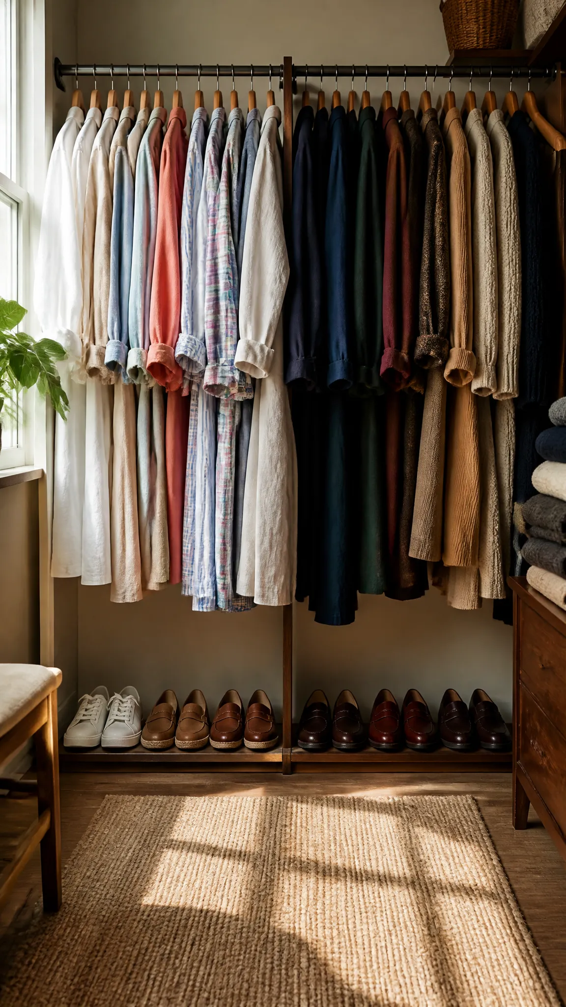
A consistent wardrobe should change in tone rather than become entirely different every season. Your core navy, white, khaki, and gray pieces can remain, while fabric, color depth, and contrast shift with the weather and occasion.
Spring and summer
Warm-weather preppy outfits favor lighter values and breathable materials. White, cream, stone, sky blue, pale yellow, mint, coral, and faded red feel at home in linen shirts, cotton polos, seersucker jackets, madras shirts, chino shorts, and canvas sneakers.
Lower contrast often looks natural in bright sunlight. Try a pale blue Oxford shirt with stone chinos and tan loafers, or a cream polo with faded red shorts and white sneakers. Navy can anchor these airy combinations through an unlined blazer, lightweight sweater, or woven belt.
Fall and winter
Cooler weather supports deeper colors and richer textures. Bottle green, burgundy, rust, camel, charcoal, and dark navy suit Shetland sweaters, corduroy trousers, waxed cotton jackets, tweed sport coats, and wool scarves.
Texture keeps a dark outfit from becoming flat. A navy cable-knit sweater, gray flannel trousers, burgundy socks, and brown suede loafers contain little bright color, yet their varied surfaces give the combination depth.
Setting matters too. Offices and dressier events generally reward restrained accents and cleaner contrast. Weekends, vacations, and outdoor gatherings leave more room for madras, colorful shorts, rugby shirts, and playful accessories.
Coordinate Shoes, Belts, and Small Accessories
Accessories should support the palette rather than introduce an unrelated color system. Brown leather is especially useful because its warm range, from tan to dark chocolate, complements khaki, navy, olive, burgundy, cream, and gray.
Your belt and shoes need not match exactly. They should simply belong to the same general color family and level of formality. Medium-brown penny loafers can pair with a slightly darker leather belt, while suede loafers work comfortably with a braided or ribbon belt.
Other classic footwear options include white leather sneakers, canvas deck shoes, bucks, and dark burgundy loafers. White sneakers sharpen summer colors; suede softens tailored combinations; oxblood leather adds depth without the starkness of black.
Small accessories provide the safest place to test a new accent. Before buying bright trousers or a bold jacket, try the color in one of these controlled forms:
- A knit tie or pocket square
- Ribbed or patterned socks
- A baseball cap or wool scarf
- A striped surcingle belt
- A watch strap in leather, canvas, or woven nylon
If the color works repeatedly with clothes you already own, it may deserve a larger role later. This prevents impulse purchases from becoming closet orphans.
Avoid the Costume Effect
Preppy style can become theatrical when too many recognizable signals appear at once. A navy blazer, striped tie, crest, embroidered pants, boat shoes, and ribbon belt may each be legitimate, but together they can feel less like everyday clothing and more like a dress code from an imaginary yacht club.
The solution is editing, not abandoning the style. Combine one or two overtly preppy elements with straightforward basics. A rugby shirt works with plain jeans and simple sneakers; embroidered shorts need little more than a white Oxford shirt and brown loafers.
Also watch for excessive saturation. Pairing bright pink, kelly green, yellow, and royal blue in large blocks creates visual competition. Move one shade to the foreground and quiet the others, or substitute softer versions such as dusty rose, olive, mustard, and navy.
Finally, avoid buying color without considering repetition. A well-built preppy color palette men can use consistently should allow nearly every accent to work with at least two core neutrals. That small test improves versatility more than chasing a supposedly essential shade.
Frequently Asked Questions
Does preppy menswear have to include pastel colors?
No. Pastels suit warm weather and provide a recognizable preppy note, but they are optional. Navy, cream, gray, forest green, burgundy, camel, and brown can produce a classic wardrobe with very little pastel color.
Can men wear black in a preppy wardrobe?
Yes, especially in evening clothing, outerwear, or minimal casual outfits. Still, navy, charcoal, brown, and burgundy often coordinate more easily with traditional preppy fabrics and warm neutrals.
Which preppy colors work well with jeans?
Dark indigo jeans pair naturally with white, light blue, burgundy, forest green, gray, camel, and navy. Medium-wash denim works well with cream, faded red, pale yellow, olive, and other relaxed, sun-washed shades.
How many colors should appear in one outfit?
Two or three main colors are usually easy to manage, with a minor additional shade appearing in a pattern or accessory. More can work when several colors are muted or contained within one patterned garment.
Should a preppy palette change with skin tone?
Your core neutrals can stay consistent, but shirt and accent colors near the face deserve adjustment. If stark white feels harsh, try cream or pale blue; if dusty colors drain your complexion, choose clearer versions of green, blue, red, or pink.
Build the Wardrobe One Color at a Time
Start with navy, white, khaki, and gray pieces that already fit your life, then select two accents that coordinate with most of them. Test brighter colors through shirts or accessories before committing to larger garments.
The strongest preppy palette is not the one with the most traditional shades. It is the one that makes getting dressed simple, keeps color balanced, and still leaves enough room for personality.