Dressing in “old money” colors sounds simple until navy, beige, and white leave your closet looking more like a uniform than a considered wardrobe. The old money color palette men search for is not merely a set of muted shades, but a practical system for combining restrained colors with texture, contrast, and seasonally appropriate fabrics.
This guide explains the essential colors, how to coordinate them, and where richer accents belong without making an outfit feel showy.
What Defines the Old Money Color Palette for Men
The palette begins with colors that are easy to repeat and difficult to date. Navy, cream, camel, gray, brown, olive, and white form its foundation because they coordinate naturally and appear at home in traditional menswear fabrics.
Restraint matters more than any individual shade. A navy blazer does not create the look by itself, just as piling every neutral into one outfit does not guarantee sophistication. The aim is quiet, controlled harmony, with enough contrast to define the clothing but not so much that one item dominates.
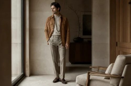
These colors also improve with texture. Cream looks substantial in cable-knit wool, olive gains depth in brushed cotton, and brown appears richer in suede than in a glossy synthetic finish. Material and color should support each other.
The visual character usually falls into three groups. Light neutrals include ivory, ecru, stone, oatmeal, and pale beige. Dark anchors include navy, charcoal, chocolate, and forest green. Earthy middle tones such as camel, taupe, tobacco, and olive connect the two.
The Core Colors and How They Work Together
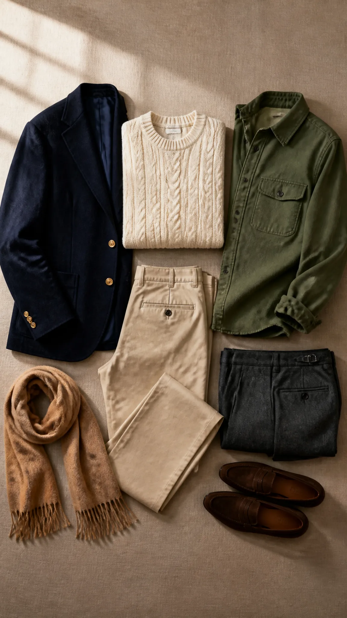
A usable wardrobe needs a hierarchy, not a drawer full of nearly identical khakis. Dark colors establish structure, pale neutrals provide freshness, and earth tones soften the transition between them.
Navy, charcoal, and deep brown
Navy is the most adaptable dark anchor in the old money color palette men can use. It works in blazers, suits, knitwear, outerwear, and trousers, while feeling less severe than black. Charcoal performs a similar role in tailored clothing, particularly during fall and winter.
Deep brown adds warmth through suede loafers, leather belts, tweed jackets, and wool trousers. Black is not forbidden, but it is generally more useful for formal evening clothes and sleek city dressing than for relaxed, heritage-inspired combinations.
Cream, white, and stone
Bright white creates crisp contrast in an Oxford shirt, linen shirt, or pocket square. Cream and ivory produce a gentler effect, especially in knitwear, casual trousers, and warm-weather tailoring.
Stone sits comfortably between white and beige. It is particularly effective for chinos because it pairs with navy, olive, burgundy, light blue, and nearly every shade of brown without drawing much attention to itself.
Camel, olive, and muted accents
Camel lends warmth to topcoats, sweaters, scarves, and tailored trousers. Olive provides subdued color in field jackets, chinos, knit ties, and quilted outerwear. Both shades feel richer when surrounded by cream or navy.
Accent colors should look slightly softened rather than electrically bright. Burgundy, bottle green, rust, dusty blue, and pale yellow can appear in a sweater, tie, shirt stripe, or sock. Think of them as punctuation, not the entire speech.
Building Color Combinations That Look Intentional
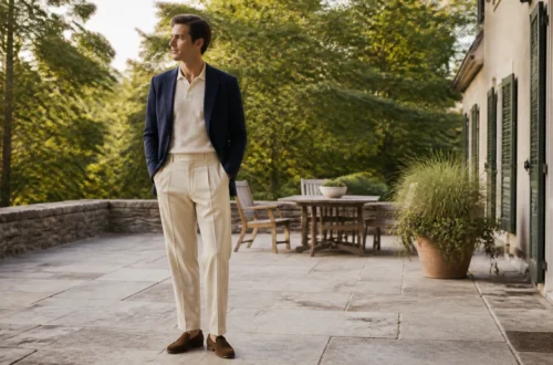
The easiest combinations rely on three roles: a base color, an anchor, and an optional accent. For example, stone chinos create the base, a navy blazer supplies the anchor, and a burgundy knit tie adds a restrained accent.
Two-color outfits often look especially assured. A cream sweater with charcoal flannel trousers has clear contrast without unnecessary complication. A pale blue Oxford shirt and olive chinos offer a softer version for casual settings.
When using three or more colors, repeat one subtly. Brown loafers can echo a brown belt, while the navy stripe in a shirt can relate to a navy jacket. Exact matching is unnecessary and can look overly calculated; the colors simply need to feel related.
These dependable combinations illustrate the balance:
- Navy blazer, white Oxford shirt, stone chinos, and dark brown loafers
- Camel sweater, pale blue shirt, charcoal trousers, and brown suede shoes
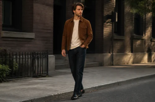
- Olive field jacket, cream knit, dark denim, and tobacco boots
- Gray suit, light blue shirt, burgundy tie, and oxblood shoes
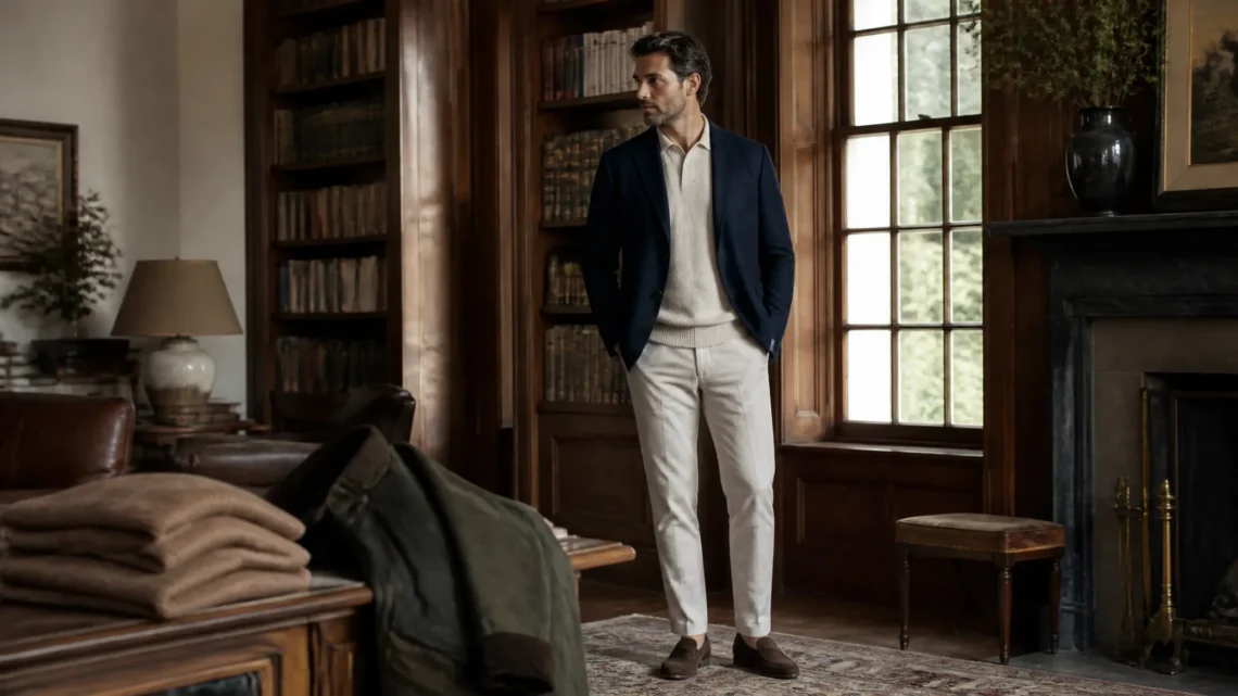
- Ivory polo, tan linen trousers, and medium-brown loafers
Be mindful of temperature, too. Navy, blue-gray, and crisp white read cooler; camel, cream, tobacco, and rust read warmer. Mixing the two groups creates balance, while an entirely warm or cool outfit gives a more tonal effect.
Translating the Palette Into Complete Outfits
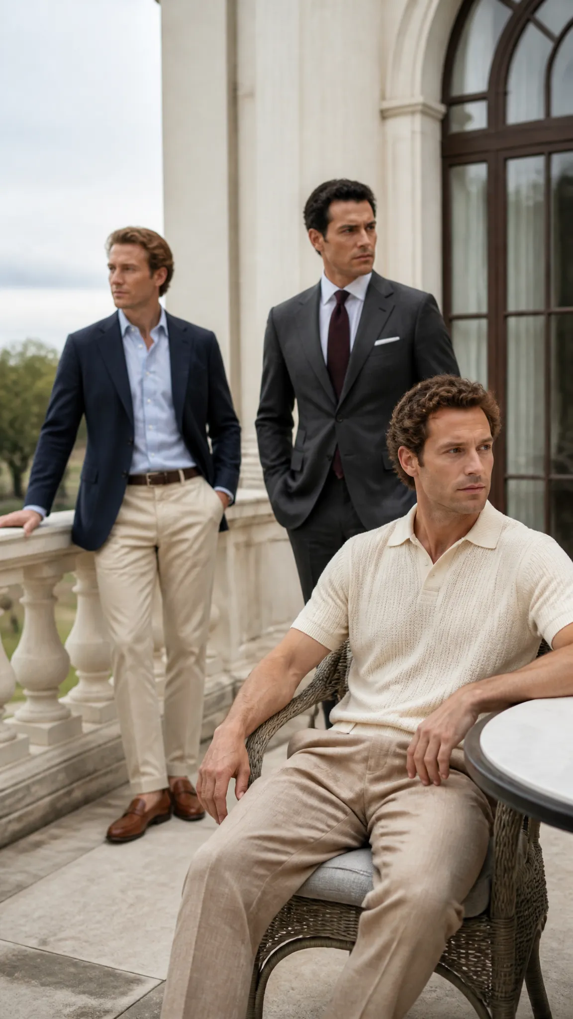
Color becomes useful only when it suits the setting. The same palette can move from a country-club lunch to an office or weekend errand by changing the garment structure and fabric.
Relaxed and weekend dressing
Start with straight or gently tapered chinos in stone, khaki, or olive. Add a white or light blue Oxford cloth button-down, then layer a navy crewneck, cream cable-knit sweater, or brown suede jacket. Penny loafers, minimal leather sneakers, or chukka boots keep the outfit grounded.
A rugby shirt can introduce burgundy, forest green, or faded yellow through broad stripes. Because the garment already carries visual character, keep the trousers and shoes neutral.
Business and smart-casual clothing
For a flexible office outfit, combine a navy hopsack blazer with gray wool trousers and a pale blue shirt. Brown derbies make the combination approachable, while a burgundy grenadine or knit tie adds color without shine.
A charcoal or mid-gray suit is equally useful. Choose white for sharper contrast or light blue for a softer transition. In business settings, restraint should come from both color and pattern scale, so fine stripes and small checks are easier to coordinate than oversized motifs.
Summer and resort combinations
Warm weather favors lighter values and breathable materials. An ivory knit polo with tan linen trousers feels polished but relaxed, while a pale blue linen shirt and white jeans produce cooler contrast.
Loafers in medium-brown suede, woven leather, or dark brown calfskin finish these outfits naturally. Keep large leather pieces understated; a huge glossy belt buckle tends to interrupt the quiet effect rather efficiently.
Texture, Pattern, and Seasonal Adjustments
A limited color palette can become flat unless fabric does some of the visual work. Texture replaces loud color by creating depth through shadow and surface variation.
In fall and winter, flannel, tweed, corduroy, cashmere, lambswool, and suede deepen navy, gray, olive, and brown. Try charcoal flannel trousers with a camel sweater, or an olive tweed jacket over an ecru rollneck. Heavier fabrics support darker, earthier shades.
Spring and summer call for linen, cotton poplin, seersucker, fresco wool, and lightweight knitwear. These materials suit white, cream, sand, pale blue, and washed navy because their open or slightly irregular surfaces prevent light colors from appearing sterile.
Traditional patterns fit easily when their colors remain restrained. Herringbone adds interest to gray or brown cloth; windowpane checks bring dimension to a navy jacket; Bengal stripes enliven a blue-and-white shirt. Use one clearly patterned garment at a time unless the patterns differ significantly in scale.
Seasonal shifts need not require separate wardrobes. The old money color palette men wear year-round stays consistent while its weight and emphasis change: cream linen replaces cream wool, tobacco suede gives way to medium-brown leather, and charcoal yields more space to stone or pale gray.
Choosing Colors for Your Complexion and Existing Closet
A classic palette should serve the wearer rather than force everyone into the same shade of beige. Colors near your face have the greatest visual impact, so adjust shirts, polos, scarves, and knitwear first.
If stark white makes you look washed out, choose ivory, ecru, or pale blue. If camel feels too close to your skin tone, move it away from the face by using it in trousers, shoes, or outerwear worn open over a contrasting shirt. Navy is widely adaptable, but some people may prefer softer ink blue or brighter marine blue.
Before buying new pieces, identify the dominant colors already in your closet. If you own navy jackets and brown shoes, stone trousers and pale blue shirts will connect them efficiently. If your wardrobe leans gray and black, introduce cream and burgundy before adding several warm brown shades.
Fit and condition also affect how color reads. A clean cream sweater in a flattering proportion looks deliberate; a stretched, yellowing one simply looks tired. Brush wool, treat suede appropriately, polish leather, and separate off-whites carefully when laundering to preserve their character.
Common Color Mistakes That Undermine the Look
The most common mistake is interpreting quiet luxury as “wear beige everywhere.” An all-beige outfit can work, but it needs visible differences in value and texture, such as an ivory knit polo, tan linen trousers, and dark brown loafers.
Another problem is excessive matching. Shoes, belt, watch strap, bag, and sunglasses do not need to be the same brown. Related shades often look more natural, provided their undertones do not clash dramatically.
Avoid relying on highly saturated accents, prominent branding, or shiny synthetic fabrics to create interest. One bright item can overpower the muted framework, while multiple status signals make the clothing feel performative rather than assured.
Finally, do not ignore contrast. Navy worn with charcoal can merge under low light, while cream next to pale beige may lose definition. Place a noticeably lighter or darker garment between close shades, or separate them with texture.
Frequently Asked Questions
Can black be part of an old-money color palette?
Yes, particularly in tuxedos, formal shoes, evening overcoats, and streamlined urban outfits. For daytime casual wear, navy, charcoal, and dark brown usually integrate more softly with cream, camel, and olive.
What is the best first color for a blazer?
Navy is generally the most versatile choice because it works with gray wool trousers, stone chinos, denim, white shirts, and pale blue shirts. A matte or lightly textured cloth is easier to dress down than a shiny suit-like fabric.
Do shoes and belts have to match exactly?
No. They should usually belong to the same general color family and level of formality, but exact matching is not required. Dark brown shoes with a slightly lighter brown belt often look more natural than a perfectly matched set.
How can brighter colors fit into this style?
Use a softened version in a small area, such as a dusty yellow polo, burgundy tie, or muted red stripe. Surround it with navy, gray, cream, or brown so the accent remains secondary.
Is this palette suitable for casual clothing?
Absolutely. Navy sweatshirts, ecru jeans, olive overshirts, gray tees, and brown suede sneakers apply the same color logic without requiring tailoring. Favor clean fits, substantial fabrics, and minimal graphics.
Start With a Small, Connected Palette
You do not need to replace your wardrobe to use this color system. Begin with one dark anchor, one pale neutral, and one warm earth tone, then make sure each new garment coordinates with at least two pieces you already own.
Navy, stone, and brown offer a particularly forgiving starting point. Once that foundation works, cream, olive, burgundy, and seasonal textures can add personality without disturbing the calm, coherent effect.